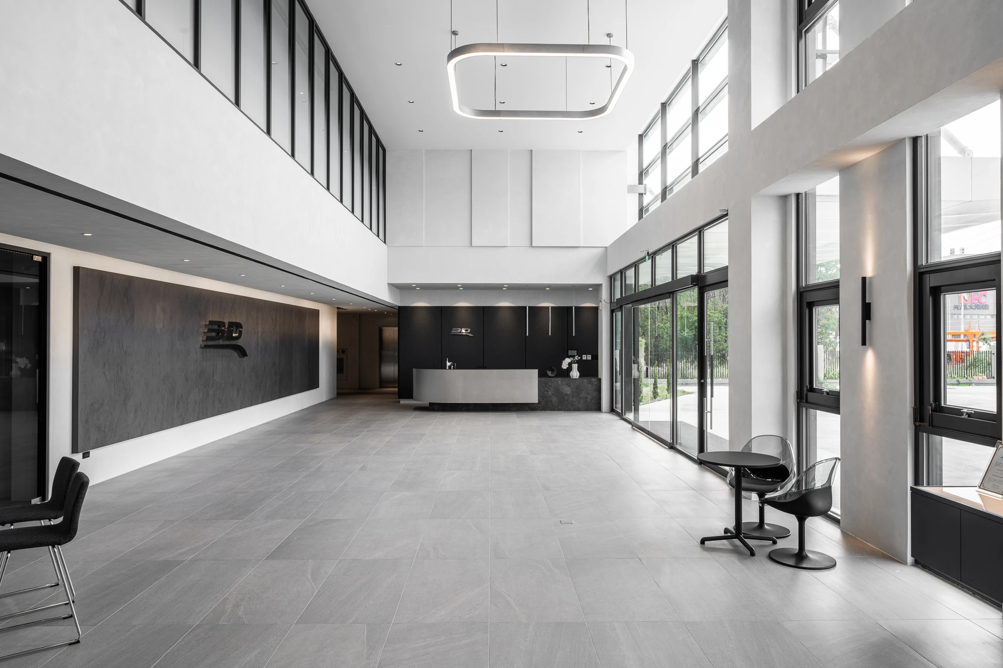
When photographing a workplace, the reception area is often the easiest frame to choose first. Height, windows, and a long counter can establish an immediate impression. A polished wide view does not necessarily tell a reader how someone enters, where products are displayed, or how office and meeting areas relate to one another.
This interior series at a factory in Pingtung was photographed for the project designer. The Work page places the emphasis on the built environment—reception, product display, offices, meeting rooms, and shared facilities—rather than on the manufacturing process. The three viewing distances below suggest a practical order: show direction first, retain material relationships, then let the scale of use appear.
Begin with the direction into the space
In the lead photograph, the long counter extends through the reception area while tall windows pull the eye upwards. The wide frame has a specific job: it explains the scale near the entrance and lets the counter, windows, and depth exist together.
When choosing the first photograph of a workplace, set colour and decoration aside for a moment. Ask instead: if this is the reader’s first view, can they tell where they are standing? When the entrance, principal boundaries, and height remain legible, the image offers more useful information than the general impression that the room is large.
The words should remain within the evidence as well. A reception area can describe an entrance and a spatial scale. A counter alone cannot establish a company’s visitor process, daily footfall, or pattern of use.
Move closer so material and display have a scale
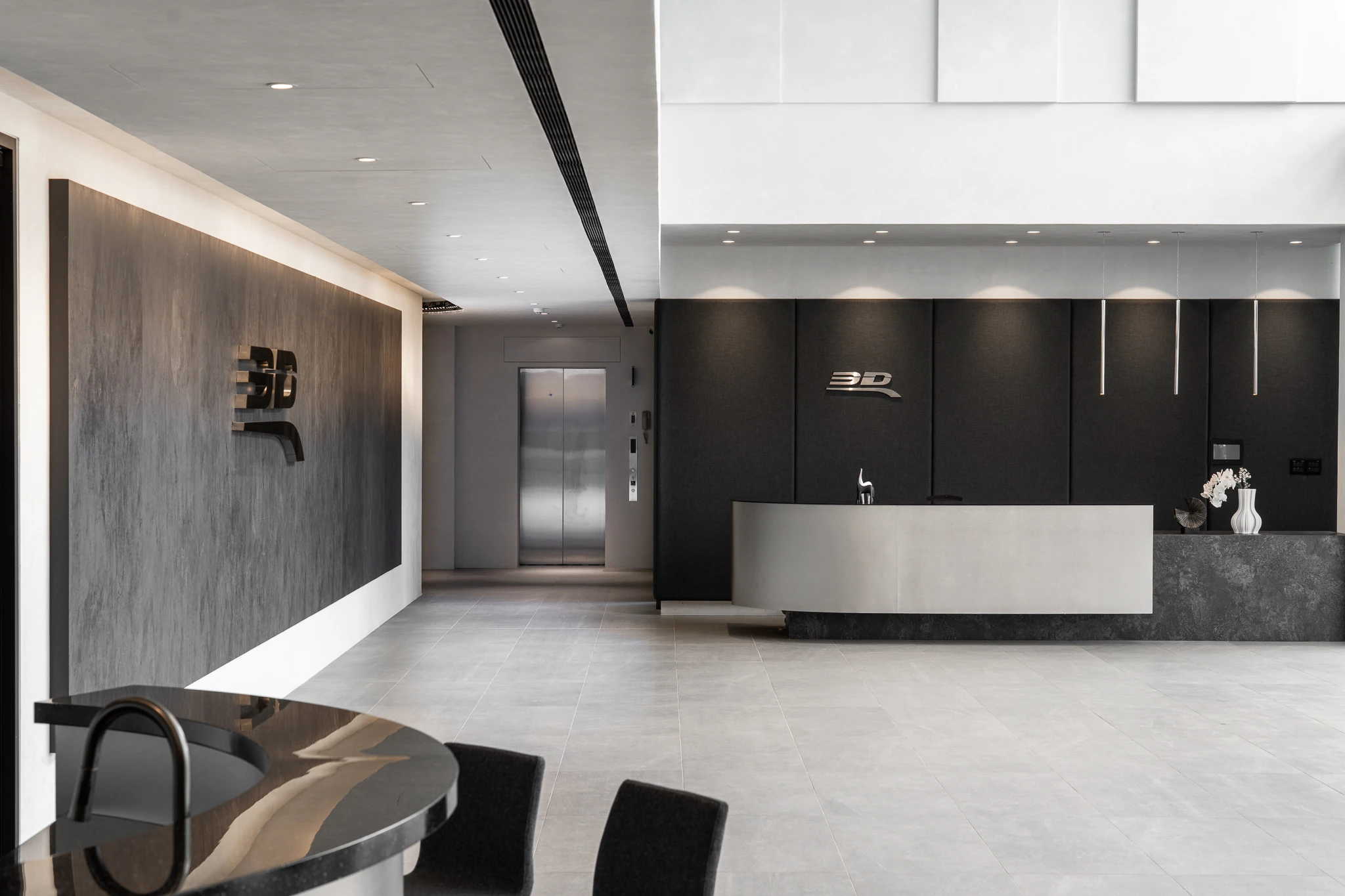
The second photograph moves towards the counter and grey textured wall. Once a wide frame has established the size of a room, a closer view can add the distance needed to read surfaces and their joins. The counter is no longer only a line at the entrance, and the wall is not only a background colour.
The aim is not to turn every material into a catalogue sample. It is to retain its relationship to the room’s boundary. A crop of texture gives the reader a surface; leaving the counter or a corner in view gives that surface a point of comparison. For a workplace, this can communicate more than a general statement about atmosphere.
A display wall in the frame does not establish its purpose or how often it changes. Describe the visible arrangement, and verify the background information separately.
An office area needs another scale of reading
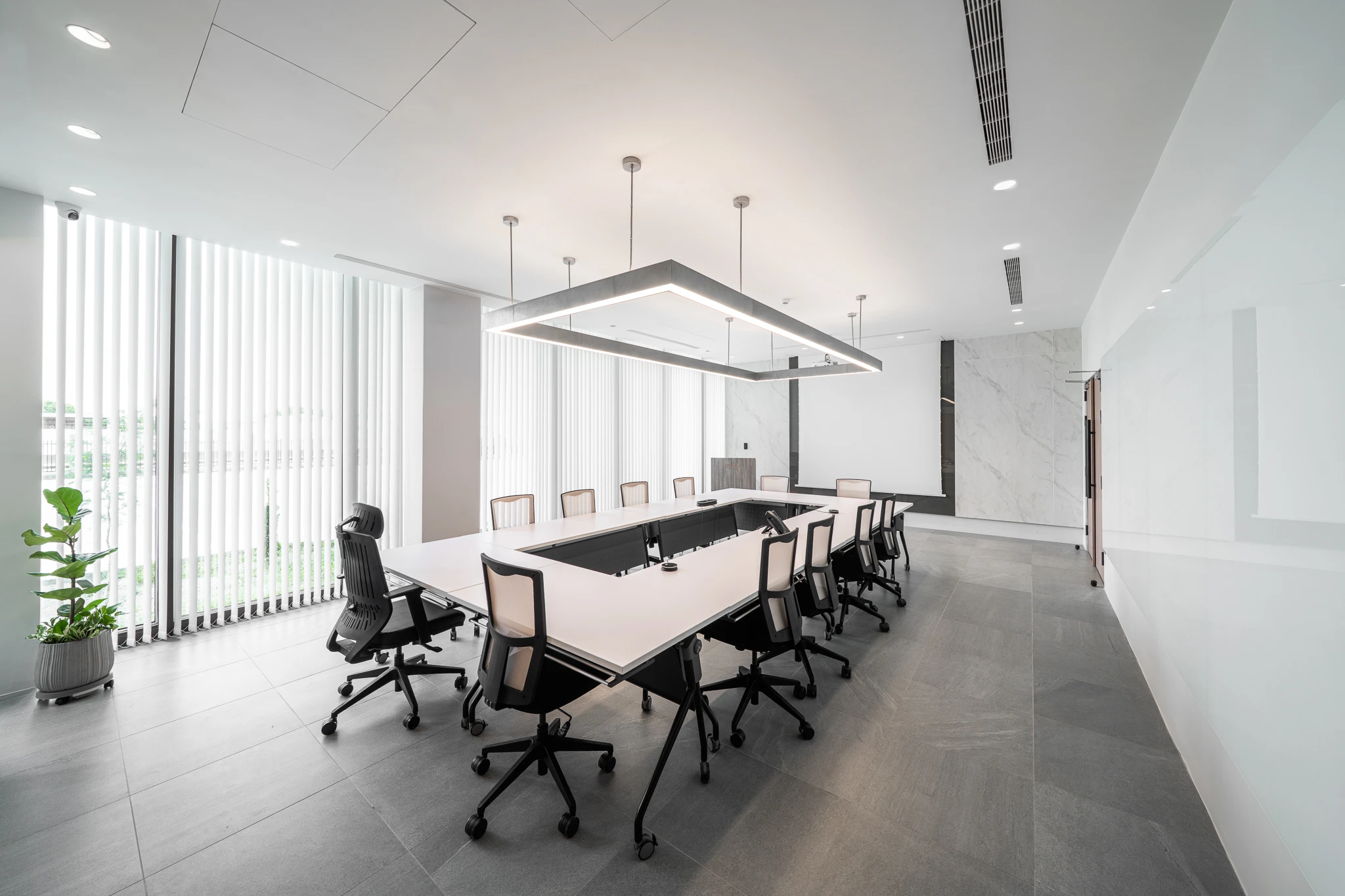
The meeting table and chairs move the story from reception towards the way work may be arranged. The distance between the table, seating, and windows gives the viewer a possible circulation path, so the words “office space” need not do all the work.
Look at the room left between furniture. Is a route still visible? Where does the daylight land? Does the table open the view sideways, or lead it deeper into the room? These relationships can support a spatial narrative. Whether people are actually using the room at that moment, or how many meetings take place there, should not be inferred from empty chairs.
Wide view, material relationship, and working scale answer different questions. Together they prevent the reader from remembering only a polished entrance while missing how the workplace is organised.
Before delivery, ask three questions
- Does the first frame show an entrance, boundaries, and height rather than only spaciousness?
- Does the close view retain enough spatial reference for the material to be compared?
- Does the office or meeting frame show furniture and circulation without inventing a use scenario?
The Pingtung factory workplace series focuses on the completed interior environment. If the shoot is still being planned, our brand photography shot list can help define placements and uses first. Once a space is understood, style has somewhere precise to begin.