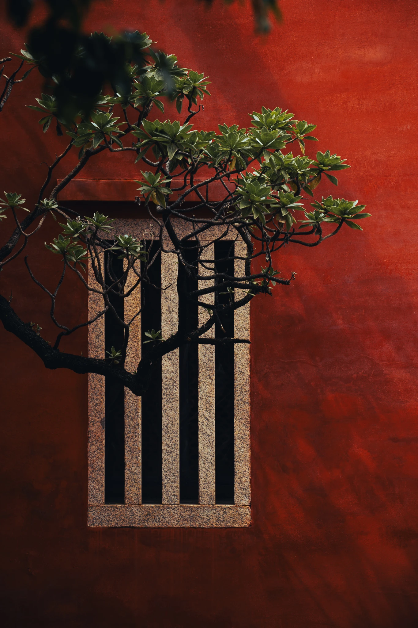
When photographing a cultural space, it is easy to begin with an obvious feature: a red wall, a gate, or an architectural detail that can be named quickly. Naming is an entry point, not the whole act of looking. Colour changes its weight in a photograph when it meets different light, surfaces, and neighbouring forms.
This series at Tainan Confucius Temple is presented on the Work page as a personal travel study. Its attention stays with different shades of red and their relationship to stone, foliage, and shadow. Rather than treating the photographs as a historical guide, we can use two viewing distances to let colour establish a sense of space.
First see how light separates the red
The lead frame does not need to prove that the whole space contains one kind of red. Its job is to establish the range of the view. A wall, an opening, and darker areas around it give the colour a sense of front and back. As light falls across the surface, red becomes a way of distinguishing distance rather than a single swatch.
When selecting photographs of a cultural space, put “where is this?” second for a moment. Ask first whether the brighter and darker reds still refer to one another. If every frame retains the same saturation and emphasis, the series quickly loses its movement. Leaving some shadow intact allows material and depth to continue doing their work.
This is also a reason to keep the writing modest. A photograph can show a surface and a light relationship. Colour alone cannot establish a restoration date, a ritual use, or a visitor rule.
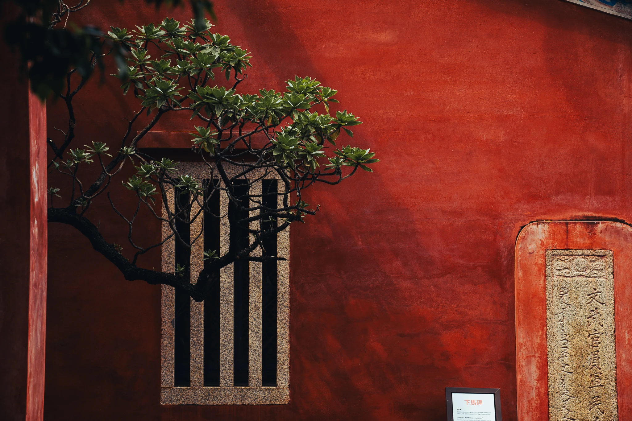
Keep stone, tree, and inscription in one relationship
The second photograph moves closer and places different materials in the same frame. A tree sits beside a stone window and inscription set into a red wall. The shape of the foliage, the edge of the stone, and the wall’s colour alter the order in which we look. Red is no longer alone; it becomes both background and reference.
A closer view does not automatically contain more information. If an inscription is cropped until it becomes only a graphic shape, the reader may not be seeing its full wording. Unless it has been checked separately, it should not be turned into a historical explanation. For image editing, keeping a visible relationship is more reliable than supplying a story for every detail.
This approach also prevents the space from becoming a single symbol. When foliage, stone, and shadow remain present, the photograph can hold both the character of the building and the detail found by moving closer.
A personal travel study is not a complete history
The Work page places this series in the context of a personal travel study. That position matters. It allows the photographer to begin with a lived act of looking without asking the images to pretend to be a complete architectural history, religious explanation, or site record.
The page can therefore discuss how red relates to stone, foliage, and shadow without assigning the space one final meaning. Opening hours, formal history, and visitor rules belong to official information, not to an inference made from a single photograph.
Choose frames that keep colour interacting
Reduce the candidates to their intended reading size and check them again. Does one frame establish the wider range, while another brings colour and material closer? Does red perform the same job in every photograph? If the answer is only “it is prominent”, the series may need a frame in which red recedes and can be compared with stone or foliage.
The complete Tainan Confucius Temple photography study contains the full image set. For more Moss & Grain observations, return to the Journal. A cultural space does not need to be explained by one photograph. Let colour, distance, and surface speak together, and the act of looking can unfold more slowly.