A menu can contain many drinks. If every photograph changes its setting, the images may struggle to feel connected to the same place. A consistent background gives the series continuity. The next question is whether each drink still has a shape of its own.
In Moonwell's cocktail menu photographs, the drinks sit on the bar's wooden surface. These three frames share a softly blurred background and square coasters. Their rims, liquid levels, and colours differ. When looking at the series, those small distinctions deserve as much attention as the setting.
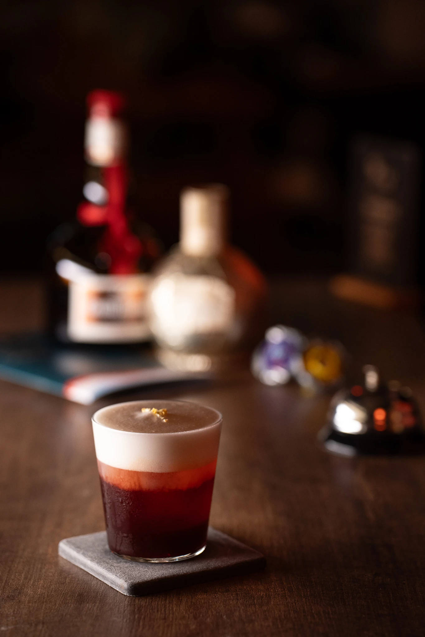
Layers rise from dark red liquid to pale foam, while the bar and softened background keep the drink in its setting.
Keep the setting steady
In the opening frame, a short glass rests on a square coaster. The wooden counter extends behind it. Objects further back remain out of focus: they give the photograph depth without competing with the glass. The counter, coaster, and background are still recognisable in the other two frames, so the viewer need not establish a new setting each time.
Using one background does not make the drinks look alike. It creates a scale against which to read them. How high is the glass? How wide is its rim? Where does the liquid sit within it? Similar framing makes these differences easier to notice.
Let the rim change the way we look
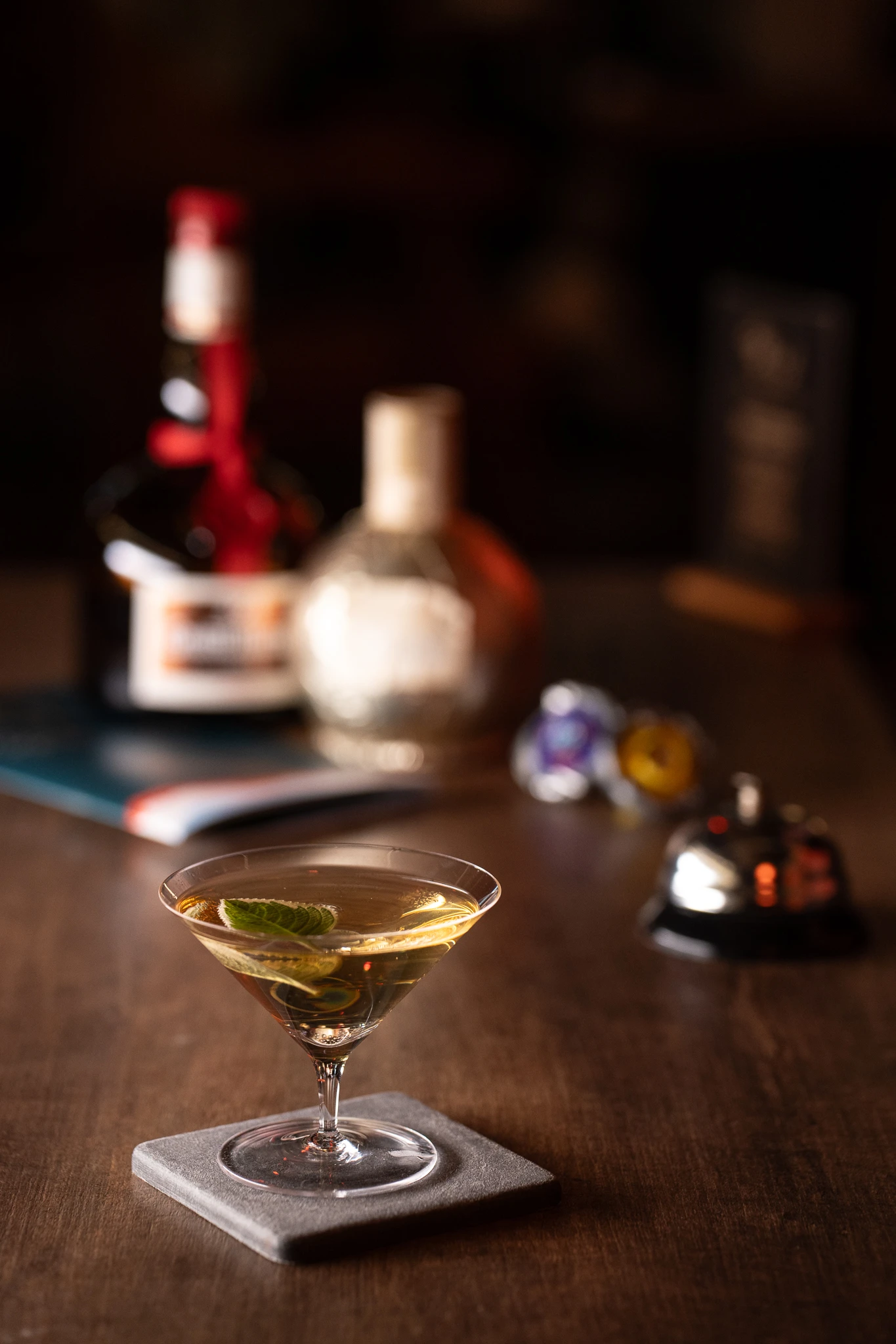
The second photograph replaces the short glass with a shallow coupe. Its rim draws the eye across the frame, and the stem lifts the drink away from the counter. The pale liquid also reads clearly against the darker area behind it. Nothing in the setting needs to change for the viewer's attention to move differently.
When editing a menu series, place the photographs side by side and temporarily hide their names. Can the glass shapes still be distinguished? A tight crop might remove the relationship between rim and stem. Too much distance can make the liquid and its surface difficult to read. The framing should preserve what helps someone recognise this particular drink.
Hold the edge against a dark background
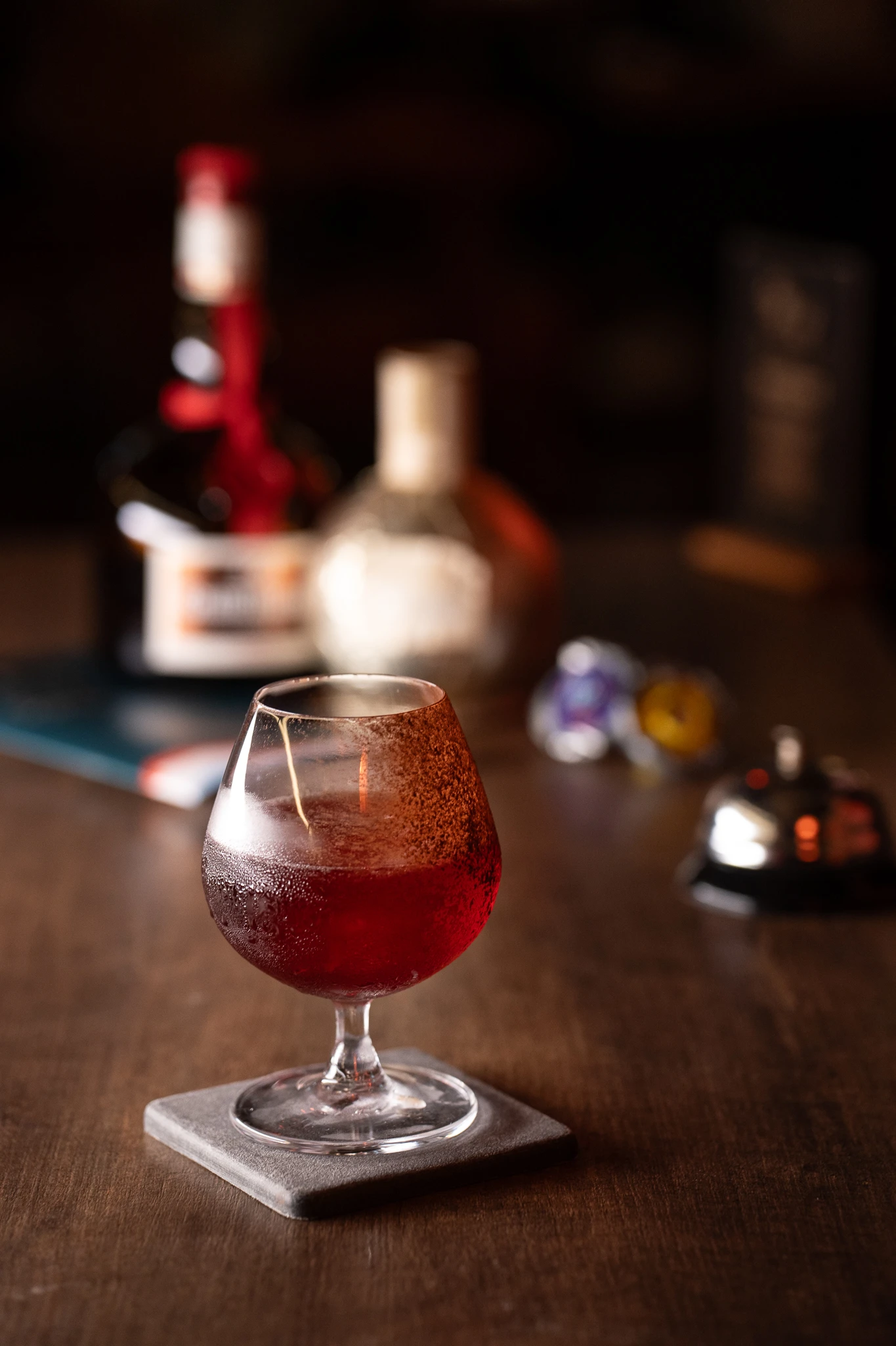
The third drink is closer in tone to the dark background. Its colour alone does not define it. Light catches the rim, the bowl curves outwards, and a small gap separates the stem from the coaster. Together, those edges make the vessel legible and keep its volume intact.
A dark drink does not always need a bright backdrop. The more useful checks are whether the glass edge remains visible, whether the liquid has become a single flat shadow, and whether there is still some separation between drink and room.
Edit the sequence, not only the individual frames
Placed together, the first image introduces layers in a short glass. The coupe then opens the composition horizontally. The rounded glass brings a fuller curve and a deeper red into view. All three belong to the same bar, yet they do not depend on identical shapes or colours to feel related.
For a menu series that will be used over time, the edit can begin with three questions. Does the background identify the place? Is the outline of each drink clear? Does the next photograph give the viewer something different to notice? A steady setting can make variation easier to see.