When photographing ruins, it is tempting to find the clearest view of a tower, keep the wall in front out of the frame and let the silhouette stand against the sky. That describes a building’s shape, but not necessarily what lies between it and the viewer. These three photographs from Moss & Grain’s Ayutthaya ruins series suggest another reading: a doorway, a near wall and an uncropped piece of background can all help us understand a place.
A doorway holds two distances
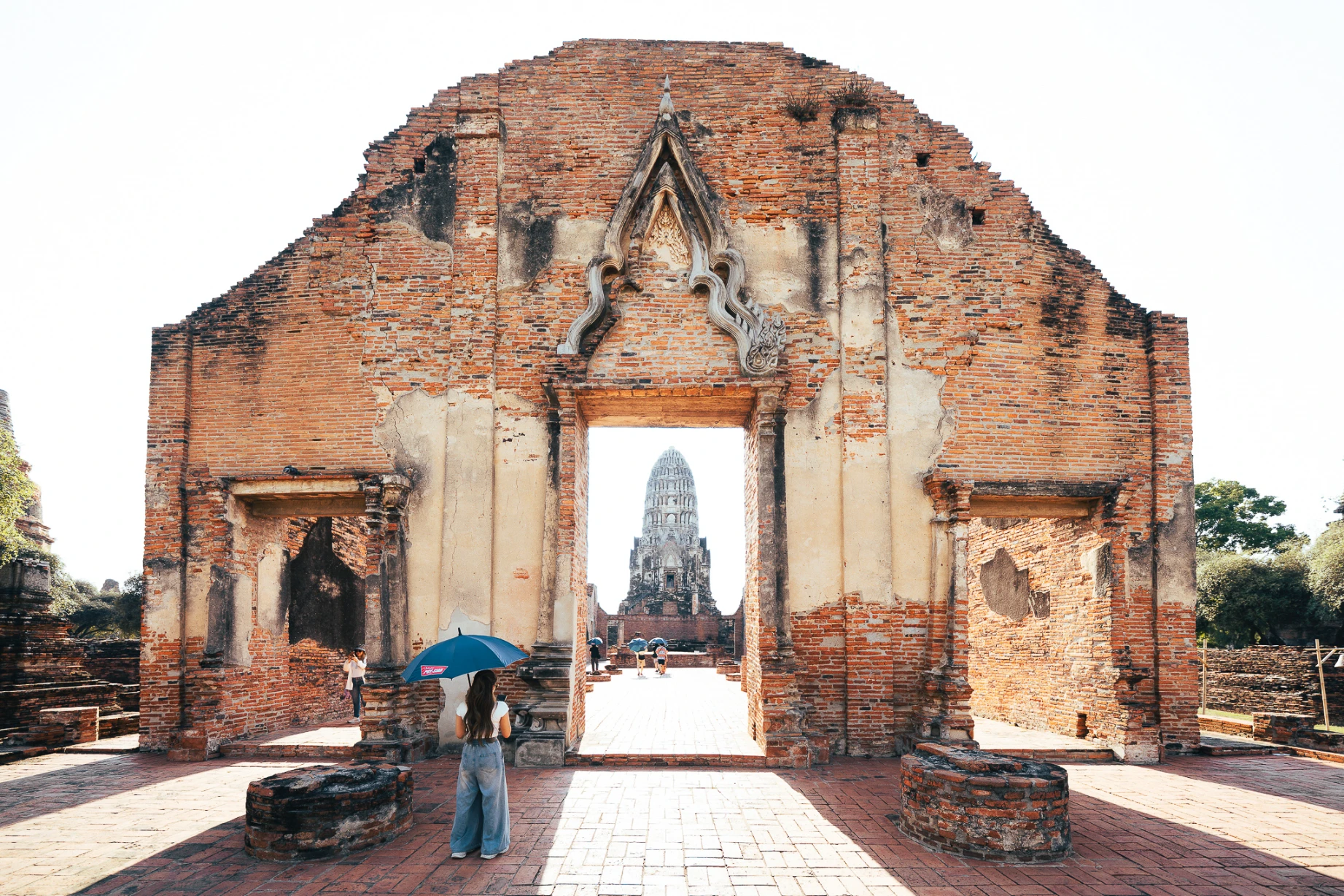
In the first photograph, the brick façade occupies most of the frame. The distant tower appears within its central doorway. A tighter view of the tower would concentrate the subject; keeping the wall lets the eye encounter a boundary before looking beyond it. The doorway does more than provide a decorative frame. It makes near and far visible together.
The visitor with a blue umbrella in front, and the smaller figures beyond the doorway, offer another comparison of scale. They cannot give us precise dimensions, but they help separate the layers. When choosing a photograph, ask what would disappear if the outer wall were removed. If the space in front of the tower becomes harder to understand, the wall is doing useful work.
One edge can be enough
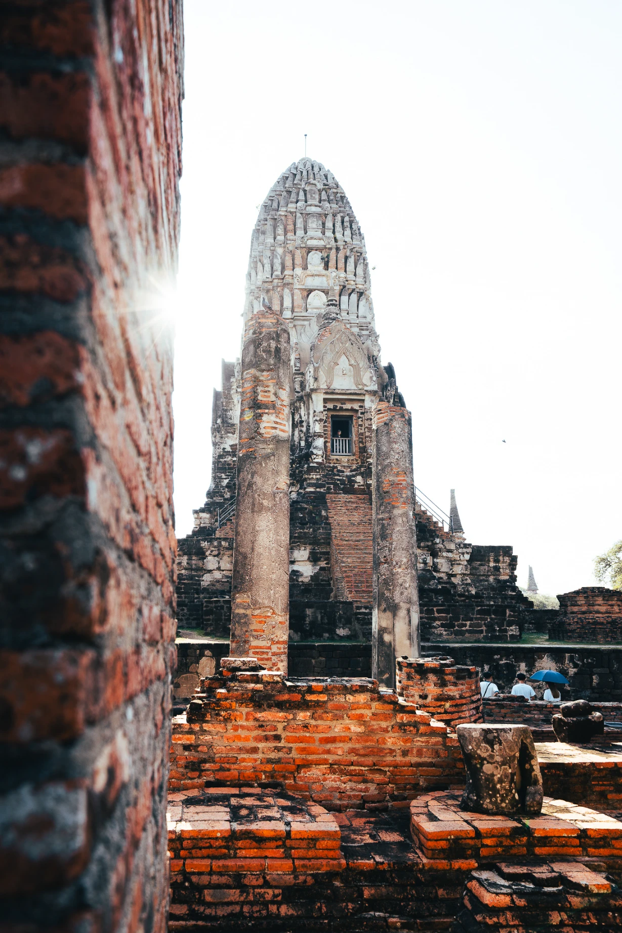
The second photograph is vertical. A softly focused wall fills its left edge, with a tower, columns and low brick walls beyond. There is no complete frame within the frame here. A single boundary is enough to suggest a view from nearby towards something further away. The near wall need not be sharp throughout: its difference from the architecture behind it contributes to the sense of depth.
More foreground is not always better. If it hides the relationship you want to show, it may simply be an obstruction. Try covering the near wall with your hand while looking at the photograph, then uncovering it. Does removing it clarify the tower, or take away the distinction between near and far? This is a more direct test than assigning the foreground a fixed proportion of every composition.
A detail needs some surroundings
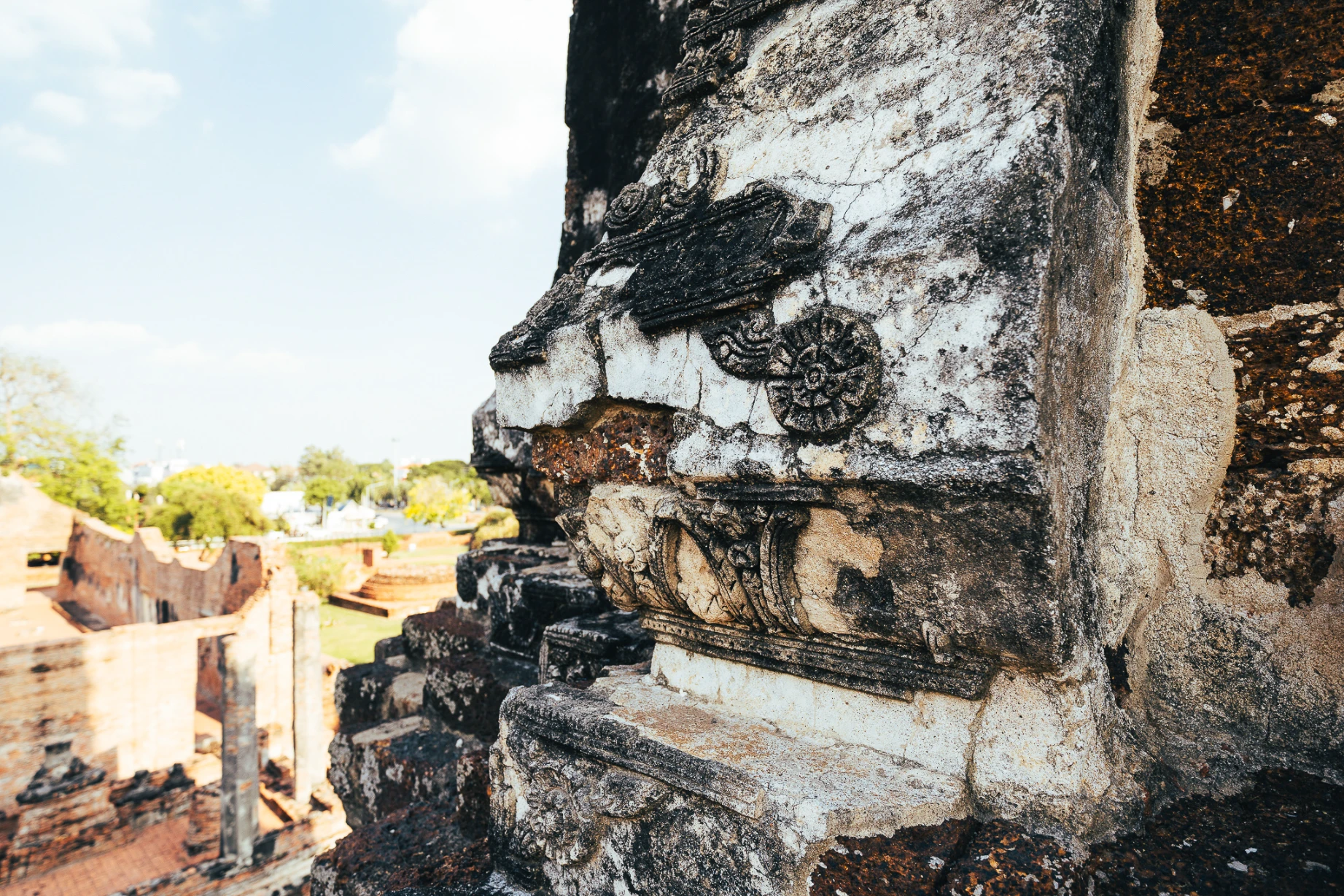
The third image brings decoration, cracks and missing surface areas into close view. The detail on the right is clear; the brick ruins and trees behind it are softer. Cropping out that background would still leave a photograph of texture, but make the setting harder to read.
This does not mean every detail must contain a wide view. It means giving the detail a location. Compare a frame concerned only with the surface with one that retains some adjacent space, then choose according to what the article needs to explain. A photograph can show cracks and decoration. Their age, causes and original meanings require evidence beyond appearance.
Let the sequence carry the distance
Placed in this order, the photographs change more than orientation. We first read the space on either side of a doorway, then separate the near wall from the tower, before coming close to a surface.
When editing your own photographs of ruins or architecture, start with one that explains a spatial relationship, then ask what a closer view adds. Two pictures that repeat the same silhouette may not both be needed. A small piece of wall that helps locate the viewer may be worth keeping at the edge. A building is more than a recognisable outline; there is also the distance between us and it.